

The challenge
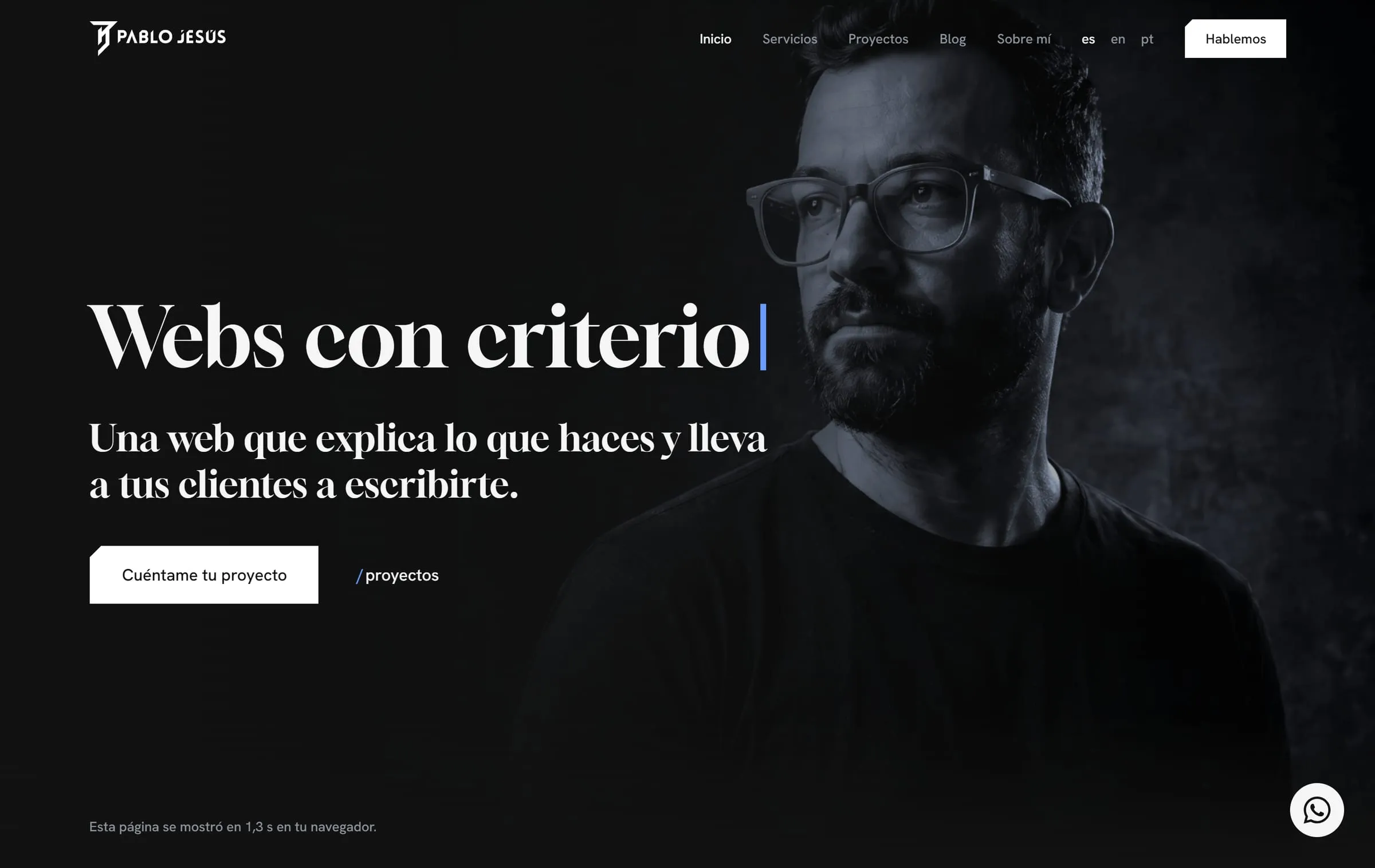
Pablo Jesús has designed and built websites since 2005. His personal brand no longer said who he is today: he needed a logo with the character and experience of more than twenty years of craft, and a website to match.
What we did
- A new monogram. The initials PJGR joined by a straight, firm line, drawn only at 0°, 45° and 90°, with the top bar ending in a diagonal cut.
- A palette of its own. Blacks and grays as the base and a bright blue, Azur, that appears once per screen.
- A typeface with personality. Gloock for headlines, in harmony with the logo.
- The logo’s cut across the whole site. Buttons, image corners and section entrances repeat the diagonal, so the brand is recognizable even when the logo isn’t in view.
- A website redesigned in Astro, in Spanish, English and Portuguese, with every design value in a single file that feeds both the site and Figma.
Result
A personal brand you recognize in every detail and a website that grows without losing consistency: a color or a typeface changes in one place and the change reaches every page. It’s the method we’re bringing to our clients’ projects: start from their brand, draw a few rules from it and build with that map.

